
Enhancing Amazon's product browsing experience
Making product information easily accessible to 200M + users

Timeline
12 weeks | May 2023 - August 2023
Collaborators
Anantika S, Elson T & Layla A
My Role
UX Research • End-to-end Product Design • Usability Testing • Design Systems
Disclaimer: Due to the confidentiality agreement signed with Amazon, I am unable to reveal the details of my design decisions & final recommendations.
Amazon's vision
How might we allow the desktop users to interact with the product by giving them more freedom & also provide easy access to additional information?


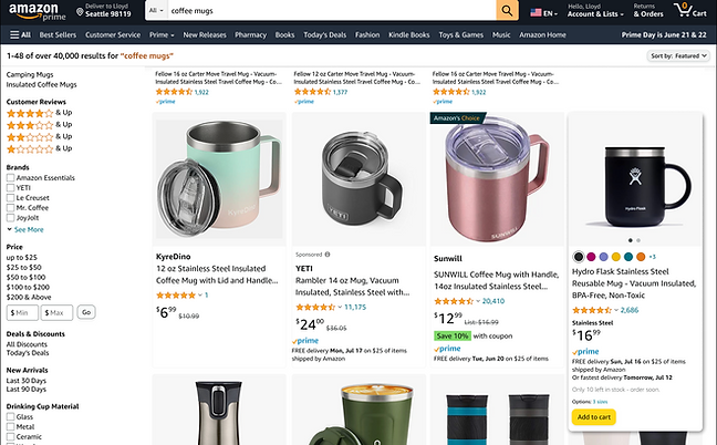
Problem space
Amazon desktop users currently face difficulty accessing extra product information on the search page itself. Typically, to view key details or add items to their cart, users must click on the product and navigate to the detail page. If the product doesn't meet their needs, they must return to the search and start anew.
Design Process
Derived from the research findings and stakeholder meetings, we decided to use the following design process to go ahead with the study.

Current Customer Journey
By identifying and focusing on the user journey, I was able to identify the most pressing current concerns
This allowed me to understand the current infrastructure and ask questions about logic, design system components, and subsequently frame how potential solutions may fit into the current solution.

Insights from Customer Journey
Secondary User Findings
To understand what the current Amazon.com Desktop version lacked, I read the feedback that users sent to our customer support team online, and then distilled user feedback based on pre tests to create an enhanced experience
70%
of the pre test users wished Amazon displayed image carousel for products
60%
of the users wished Amazon's website had more product info on the results search page
65%
of the users felt Amazon's website lacked display of products alternate choices
"I wish Amazon showed multiple images of the product on home page itself"
Participant 1
"Currently Amazon lacks the feature to add products directly to cart from the home screen"
Participant 2
"I wish there was an option to star the product I was seeing"
Participant 3
Finding Balance
After discussing with the interviewees, I figured out a balance: to design a feature that is both meaningful and engaging. This way, Amazon would keep users engaged in a meaningful way.
Avoid
Pogo
sticking
Keep
users
engaged
Meaningful & Engaging event
Competitor Analysis
In our pursuit of a thorough understanding of the client's competitive landscape, I adeptly conducted a concurrent competitive analysis.
The goal of this analysis was to determine how other competitors display additional product details to ease customers and provide them with all the information required upfront. For this I looked at 15+ competitors.
Research Insights
Based on the research conducted out of 15 competitors only 4 competitors triggered additional product detail interactions on the search results page when hovered over the products. Below is how their experience works
Finding #1 - Alt Images & Sizes
The Flipkart app displayed additional information like size on hover, further one can view alternate product images however the feature is not very intuitive.


Finding #2 - Color Choices
Walmart showed the change of state when hovered over the color thumbnails swatches.
Finding #3 - Product Details
Google shopping does a good job on triggering additional product details when hovered over the product. Additional product description, delivery details etc is displayed for the featured products

Research Impact on Design
We then developed the fundamental concepts for how users should feel and experience this tool.
Informative
Helps consumers by providing product details

Intuitive
Users can easily find and navigate through the proposed feature

Conventional
Following conventions users are familiar with
Design
Hypothesis
The hypothesis I was leaning towards was that the proposed CX would increase more product exploration and enhance the engagement with respect to the whole page experience for customers.
01
Proposed CX will offer a more engaging experience to the customers and reduce customer sentiments of feeling lost on search page.
02
Proposed CX will increase product discovery and exploration, and ultimately increase page engagement rate.
03
Proposed CX will increase customer satisfaction by helping customers focus on products & provide necessary product details on search.
Design Concept
The proposed concept experience more responsive, by giving customers more visual cues and information. Customers will have the freedom to hover over the product experience a more engaging setup.

Responsive
product browsing

Display of additional info on interaction

One step add-to-cart
button
Conceptualization Stage
Based on the design requirements I created, I ideated several design solutions and worked with my mentor and Manager to prioritize and better understand how these solutions would fit in with business needs and engineering constraints. This helped me determine which design solutions were worth exploring further, and which ones I should leave as just opportunities to explore at a later time.


Narrowing down on
the ideas
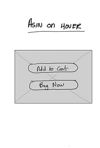
Concept 1
Displaying product title details and the option to Buy Now or Add to Cart on hover


Concept 2
Displaying product image views, color swatches and additional product details on hover

Concept 3
Displaying product swatches, additional delivery options, Add to cart features and alt product views on hover interaction
Feedback! Feedback & Feedback!
I presented initial solutions along with the benefits and challenges with each approach at our SCX Weekly Design Team share to the project managers, designers and the developers.

Stage 3
Feedback Insights
Consider Technical Feasibility of proposed CX
1
The time & efforts required for feature maintenance
2
Accessibility and interaction behavior
3
User Testing
As I wanted to further improve the proposed idea & test how customers would perceive this new experience I began preparing the script to conduct the user study to get the most authentic results.
10
participants
GenZ 11-26 | Millennials 27-42 | GenX 43-58

Research Question 1.
Would it help customers make quicker purchasing decisions?
Research Question 2.
Would the proposed CX reduce back & forth between pages?
User Testing Analysis
Overall participants did feel the proposed CX would save a lot of time especially in cases where they do not have a fixed product in mind that they wish to buy.
Further user testers felt this particular CX would make the browsing experience more interesting and fun.
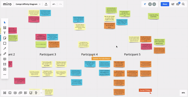
Gaining clarity amidst the havoc!
After conducting my initial usability test, I was able to synthesize the data I uncovered into an affinity map, which I then organized into groups of key insights and findings.

User Testing secrets we found...
77%
Time Saver
7 out of 9 participants felt the proposed CX would make browsing and shopping for products quicker.
66%
Displayed Info
6 out of 9 participants felt the details displayed and proposed CX was very relevant to their current needs.
88%
Influence them
8 out of 9 participants felt the proposed CX would help them narrow choices and possibly influence purchasing decision.
100%
Useage
9 out of 9 participants felt they would want to see and use the proposed CX live as it would help with selection.
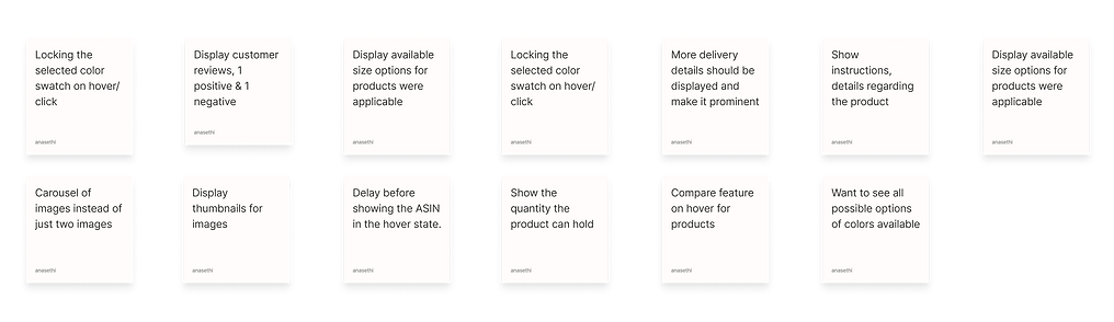
Suggestions from Usability Test Participants
Based on the usability test analysis conducted on UserTesting.com I was able to find valuable suggestions and ideas to create a better and enhanced customer experience for the proposed solution.

Gen Z Participant
“I like being able to see image and know as much info without clicking because it really lets me see if it's a product I am interested without leaving the page.”

Gen X Participant
“I think this prototype can be a complete replacement for having to click on the product and then see details. It makes narrowing down options so quick”

Millennial Participant
Seeing the different colors incredibly useful. I do not have to click on the cup and then click out to see other products, now I just have to hover. "Excellent quality of life feature"
Design System


IMPACT
The project was a great success and was presented to manager, my mentor, Principle Design Director and the entire Search Design Team. During my internship I also received an Accolade for my contributions
The concept was developed by the dev team and is now in the feature ideation stage.
The summer of new learnings

"I enjoyed the independence & initiative I got to take on my own while still having teammates available to help when"
Embracing limits for focus
Internship broadened my design scope - from quick engineering fixes to visionary brainstorming. I discovered the "wide vs. deep" approach, highlighting the value of both broad exploration and focused problem-solving.
Design solutions have tradeoff
Sometimes the business interests conflict with user needs, and what designers need to do is to find a “sweet spot” where both needs are balanced.
More & more feedback
To succeed, designers need feedback from users, stakeholders, and peers. They should carry the feedback along the design journey and constantly iterate based on it.
Users think differently
To design intuitive products, designers need to talk to wide ranges of potential users and get feedback from them.
Concept 1
Displaying product title details and the option to Buy Now or Add to Cart on hover
Design solution
Narrowing down on refined ideas


02
Never forget your assigned tasks now!
02
Never forget your assigned tasks now!