
US Department of Agriculture -
ACIR Portal UX Evaluation
Industry Advised Project- US Department of Agriculture (USDA)
Time Frame - Jan 2023 - April 2023 (12 weeks)
Team- Anantika Sethi, Harper Ma, Pragya Joshi, Ziyi Jiang, Zhaoyi Meng
My Role: User, Research, User testing, Heuristics Evaluation, Survey, Video & Strategy
Tools: Figma, Adobe Premier Pro, Miro, Google Sheets
In the winter semester at University of Michigan I had the pleasure of working with the US Department of Agriculture (USDA) on their ACIR database. As a team we collaborated with a cross functional team to conduct an in-depth UX evaluation of their current tool.


Our Objective
How users at different organizational levels are searching the ACIR database. Our goal is to make the system more intuitive and create a seamless navigation so that the client’s requests are addressed as effectively as possible.
-
Capturing users search pattern
-
Finding out the pain-point of current search process
-
Providing recommendations on search terms, system instructions
Our Design Process
My journey can be summarized by the following:
1
2
3
4
5
Interaction Map
User Interviews
Comparative Evaluation
Heuristics Evaluation
Usability Test
Target Audience
We began to define who our target users of ACIR are. This would allow us to better evaluate the portal from different user groups lenses.
External Users
Importers & Exporters
USDA Users
APHIS Users, Field Operations & Plant Inspection Team

Live auditing the current portal
To learn more about how users perform activities, I conducted a diagnostic analysis of the current ASIR customer experience. The output was mainly 4 broad categories of customers based issues.
The four key sections we looked at were-
1.Searching for import requirements based on a commodity name and country.
2.Finding information about possible treatments that need to be done to the commodity
3.Clarifying information regarding terms of commodities used and other technical jargon
4.Finding information about certain ports, regions and crop groups

Information Overload
Currently the portal has too much Information overload on the search engine
Hidden
Content
Important information is hidden in the ‘Help’ link
Lack of Info Hierarchy
Redundant items in navigation bar without hierarchy
Information Organization
There is a lack of organization in the content and sections in the portal
User Interviews
Through the user interviews we aim to study and gather information on how users interact with ACIR, what is working well with the system and the key challenges and pain points they are experiencing.




10+

Internal USDA Interviews
External Vendor Participants
Interview Research Goals
1. The overall information architecture of the website, especially the organization of the navigation bar and the different types or “tiles” of the search tools.
2. The usability of the whole search process, including the design and wording of both visual elements and text content.
3. The accessibility and effectiveness of the help information, including the content of all types of instruction information and how users access them.
Affinity Mapping
After all interviews were complete, we conducted a thorough review of the data gathered from the interviews as a group. We used a Miro board to create the visual representation of our findings. This helped us to identify common concerns across the interviews and thus have a deeper understanding of what key issues that our participants are facing when interacting with the ACIR database.

Interview Key Findings
Finding #1 - Problems with the content that affects navigation
There are three major problems with the overall information architecture and navigation.
-
The lack of instruction navigating to the APHIS and efile
-
The overall framework or logic of the database
-
The wording of document title
Our study reveals that there are several major problems around the design of help section, overall navigation and information architecture and the interface of the search engine hindering ACIR search experience.
Finding #2 - Problems with the search engine interface
There are two major problems with the search interfaces.
-
The insufficient parameter for the input of the search
-
The technical Issues with the Input field
Finding #3 - Problems with the help section
There are two major problems with the help information.
-
The lack of prominence and pop-out effect
-
The redundancy of the content


Discover space for improvements
Competitive Analysis
As part of the efforts to improve the accessibility and usability of information on ACIR, our team has undertaken a study to evaluate different database systems and approaches. We identified our four competitors based on Newman’s types of comparison.
The four competitors we looked into were


After we selected our competitors of the tool we used a matrix to help us compare the product/ services which were based on the needs of the clients and the analysis of the results/interpretation of our interviews.
We compared the competitor tools based on the criterias of:
-
Navigation
-
Searching process
-
Display of results
-
Overall Help section and information satisfaction of the participants
Recommendations based on Analysis
We came up with the following potential recommendations and areas that we can focus on based on the competitor study that we conducted. These recommendations if implemented can help fill the gap with ACIR in order to outshine and deliver to the users a seamless system.
01.
Navigation
02.
Searching Process
03.
Display of Results
The submenu can be reorganized to have more clear categories
1) The textbox of the search bar can be bigger and the font weight can be heavier to give more emphasis.
2) Allow full text match
3) Classification options like region or commodity for users to browse and search without input
1) Introducing more information separation through more dropdowns could help see relevant information quicker to find.
2) Text hierarchy could be introduced to immediately draw attention to relevant search results and when searching import requirements.

Survey -
Random Sampling Method

Objectives of conducting the survey
1. How effective is ACIR in assisting users with their day-to-day informational needs?
2. How does the ACIR experience change when it's viewed on phone vs laptop?
3. How do users prefer to have their questions answered and why?
4. What would make the Help section more effective and useful to users?
Our client USDA wanted us to run a survey instrument to gather feedback from users of the ACIR system to evaluate and improve the user experience.
Heuristic Evaluation

2
2
2
4
4
4
0
0
3
3
Our study employs a heuristic evaluation method based on Jakob's Nielsen's 10 Usability Heuristics for User Interface Design, which allows for a comprehensive and structured approach to uncovering usability issues.
The goals of this evaluation is to answer questions related to-
-
System’s ease of use
-
Error prevention
-
User satisfaction
Individual Heuristic Evaluation
Each member of the group did an individual evaluation and a 4 point severity rating which helped us identify and focus on certain top priority issues.
Using heuristics our goal was to first individually discover the usability problems with individual elements.
Rating Scale
0 Don't agree that this is a usability problem
1 Cosmetic Problem
2 Minor usability problem
3 Major usability problem, important to fix
4 Usability catastrophe; imperative to fix
Walkthrough of Usability Concerns
Each member of the group did an individual evaluation and a 4 point severity rating which helped us identify and focus on certain top priority issues.
Using heuristics our goal was to first individually discover the usability problems with individual elements.
Finding #1
Severity Rating 4
Heuristic violated:
-
Help and Documentation
-
Error Prevention
-
Help Users Recognize Diagnose, and Recover From Errors
When inputting the name of a commodity in the search bar, it displays no results if an extra space has been included in the search.

Finding #2
Severity Rating 3
Heuristic violated:
-
Error Prevention
-
Visibility of System Status
Rearrangement of dropdown menu items leads to selecting the incorrect option

Shortcomings of the study
01
Our heuristic evaluation relied on a binary evaluation of issues – either a problem is present or it is not. This can be limiting, as some issues may be more or less severe depending on the context or user group.
02
Our heuristic evaluation was performed in our own space, which may not reflect the real-world context in which the real users will interact with the interface. This can result in issues being identified that are not actually problematic in the real world, or conversely, missing issues that are only present in specific contexts.
Final Design Recommendation
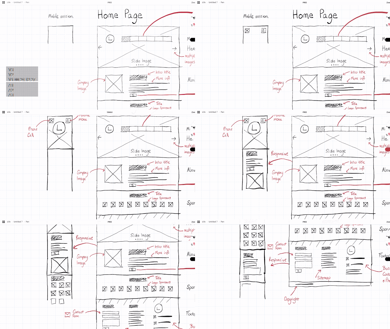
Each member of the group did an individual evaluation and a 4 point severity rating which helped us identify and focus on certain top priority issues.
Using heuristics our goal was to first individually discover the usability problems with individual elements.
Research Impact on Design
The research learnings above, as well as competitive analysis, interviews, evaluations and alignment with the product team, informed and help lay out the following design principles for recommendations .

Feedback & Affordance

Easy Access
Optimized, Information Structure
Recommended Solutions

Recommendation 1
Pain Point Users are overwhelmed by the text-heavy layout and the presence of over information in the pages and navigation
Tabs that users do not require as part of their workflow, such as Taxonomy, can be removed from the main navigation and appear as a nested option.
Recommendation 2
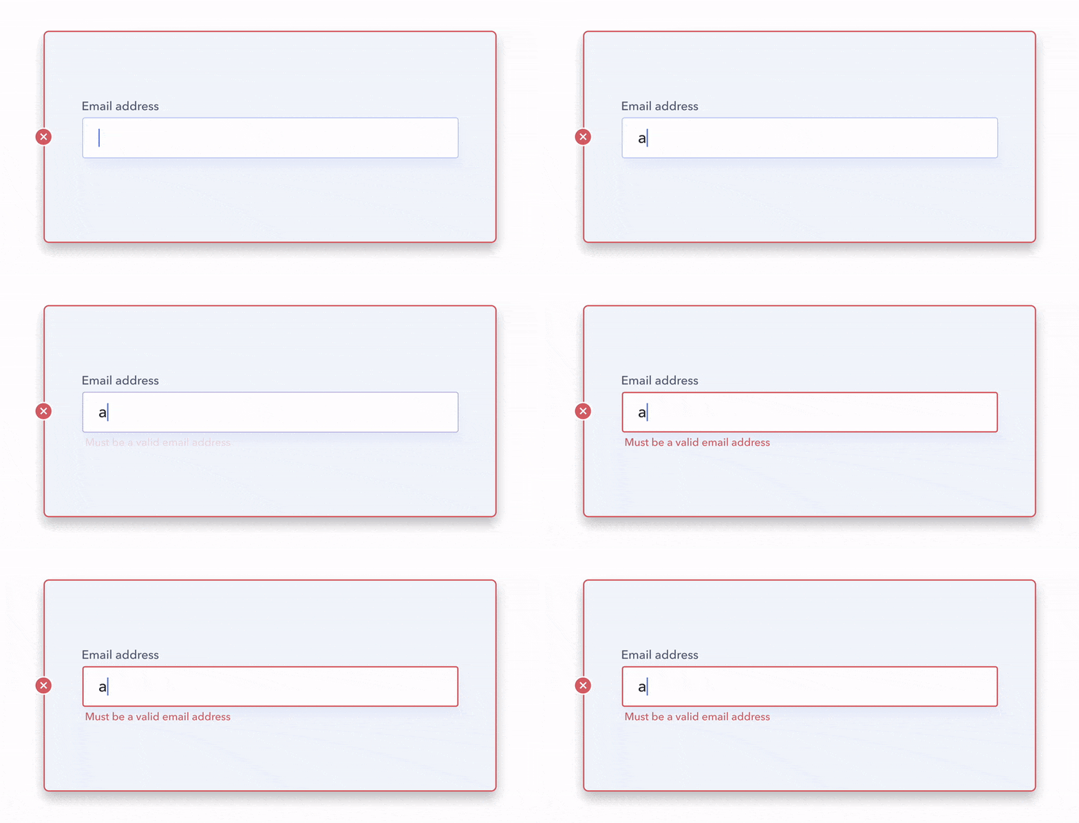
Pain points in the search process
When inputting the name of a commodity in the search bar, it displays no results if an extra space has been included in the search.
The system could provide an error message that explains why spaces are not allowed when a user enters an additional space after their input to help users diagnose the error.
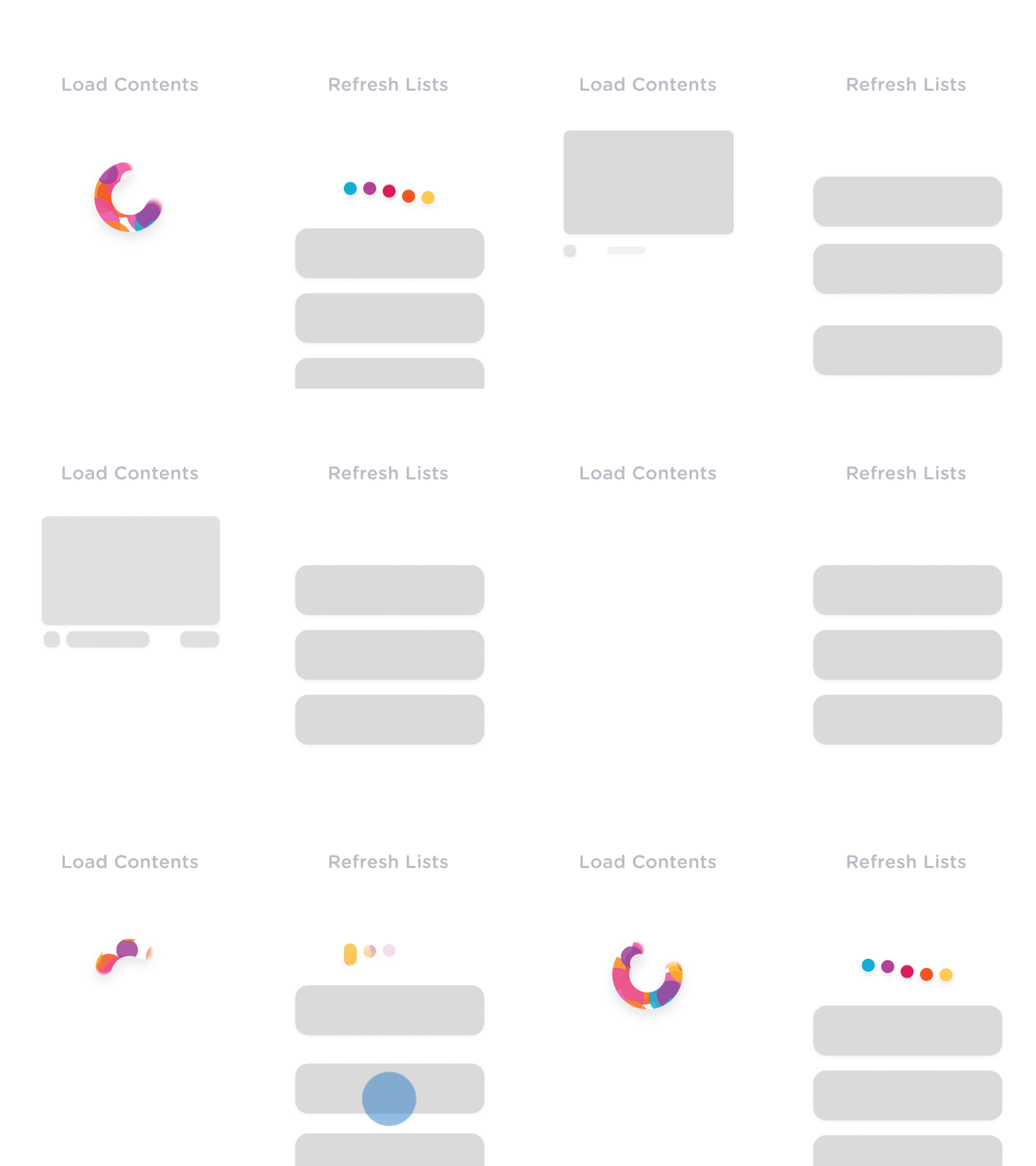
Recommendation 3
Pain points in the search process
When inputting the name of a commodity in the search bar, it displays no results if an extra space has been included in the search.
The system should also provide visual cues about the visibility on what the system is doing. This is key in helping users feel in control, making them aware of the context at all times, and reassuring them that the right task is effectively being worked on.
As a group we were able to Identify 30% of critical issues on the current portal, audit, provide recommendations projected to increase B2C platform business performance & productivity.
USDA implemented 3 out of our 5 suggestions in the first phase of our evaluation itself which went live on their portal


Learnings & Reflections
As the USDA serves a diverse set of users, including farmers, researchers, policymakers, and the general public. Learning to understand and cater to the needs of such diverse user groups enhanced my skills in user segmentation and platform research and evaluation.
Agriculture involves a significant amount of data. Learning to design effective data visualizations to help users make informed decisions based on the data provided on the team from USDA was a great learning experience.
The USDA websites has large user base, and gathering feedback is crucial. Learning to collect, analyze, and implement feedback on a large scale was a valuable skill that I developed working with the team as a UX designer.


